Asking your users for permission to send push notifications is crucial. This is exactly the reason why you need opt-in requests — small messages that ask whether your users would like to receive content from your website.
At Notix, you can customize your opt-in requests and make them look maximally engaging. How to do that? Which options do you have? Read this article and find out.
Step 1: Adding a subscription tag
Before you can set your permission requests, make sure to add a subscription tag first. To get your tag configured and start collecting push subscribers, please add your website or other traffic sources to the dashboard.
Log into your Notix account and open the tab called My Sources. Here:
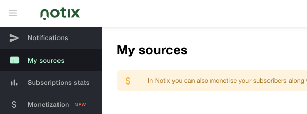
And then click the “Add your first source” button below.
After you do so, make sure to add your website name in the corresponding field. Now you are ready to create your tag.
Quick note: If your website has sub-domains with different subscription campaigns, you can place multiple tags around them. However, be attentive with two tags on one website – your users might subscribe for a single messaging only, so they won’t get notifications related to the second one (even if you set it up on the website). This means that you need one tag per one domain to collect subscribers. Use retargeting pixels to separate them into specific groups, if needed.
Step 2: Setting opt-in prompts up
Now let’s see how to set the actual opt-in request. Notix encourages you to work with manual integration or WordPress plugin, so just pick the suitable option. In this article, we will discuss the first one – Manual Integration.

Let’s move to the most interesting part – Permissions Prompt View. Notix has a number of them: Slider, Bell, Categories, Native Browser, etc. All of these prompts appear within the user’s browser and welcome him to subscribe for your push notifications.
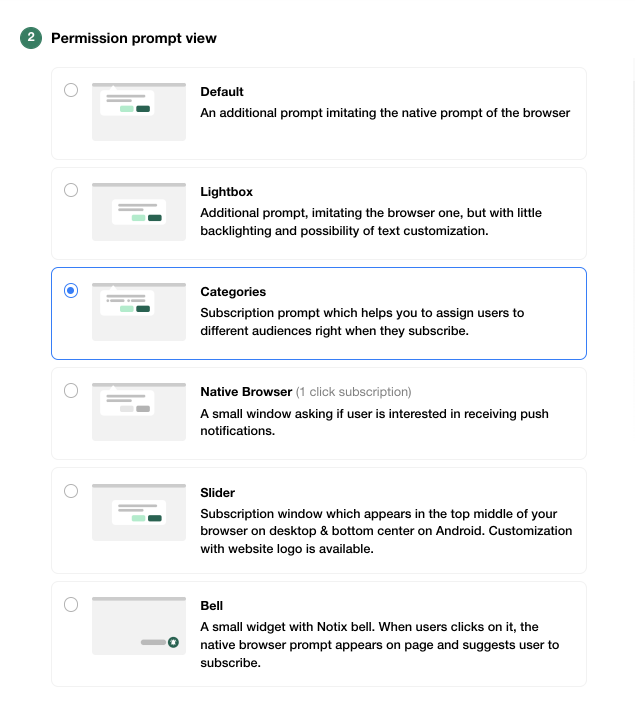
Let’s discuss the best opt-in solutions briefly:
The Slider prompt is universal. You may choose this one to create an opt-in request with your website’s logo – this would pass perfectly if you offer any kind of service. This prompt could be customized from top to bottom. Not only can you add the logo of your website here, but also create your own message and text for the button.
Best for: Services and Products, Brand websites, eCommerce, News, Entertainment
The Bell prompt is efficient for any niche, especially if your website is rich for content. Whenever you want to make your opt-in requests non-intrusive, you may rely on Bell, since this prompt is small and doesn’t distract visitors from the web page content.
Best for: News, Media, Entertainment, Lifestyle, Fashion
The Native Browser prompt is the best option for webmasters looking for an opportunity to collect as many subscribers as possible since it allows a one-step subscription. Affiliate marketers focused on massive base collection will also find the Native prompt useful. It looks like a small window that appears on the user’s screen and asks if he/she wants to receive push notifications.
Best for: News, Entertainment, Products and Services, Affiliates who collect subscribers on the landing page (for more information, check this)
And the Categories prompt type allows you to split your subscribers into audiences right after they accept the request. This prompt type is perfect for platforms with numerous sections. For example, your website could have sections like News, Weather, Fashion, Lifestyle, etc. Some of your visitors might prefer concrete topics and you may send push notifications with relevant content to them.
Best for: Media, News, eCommerce, any multiple category websites
Quick note: Please mind that every opt-in window (except the Native Browser one) entails a 2-click subscription process. First, your users will have to subscribe within the offered prompt and then – confirm their decision on the native window. After that, the subscription will be recorded into the system.
Step 3: Customization
So, now let’s customize your subscription prompt and see how it looks. First, we choose the Categories prompt for this example:
- Audience name: call your audience according to their preferred category (this information is not visible for your visitors)
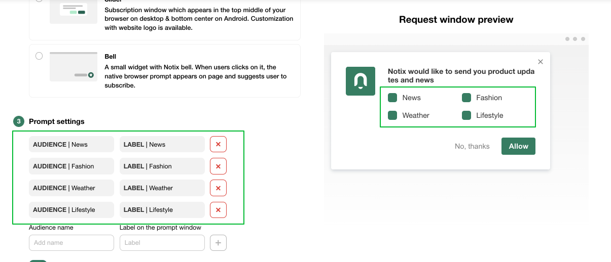
- Label prompt window: add information your visitors will see in the prompt
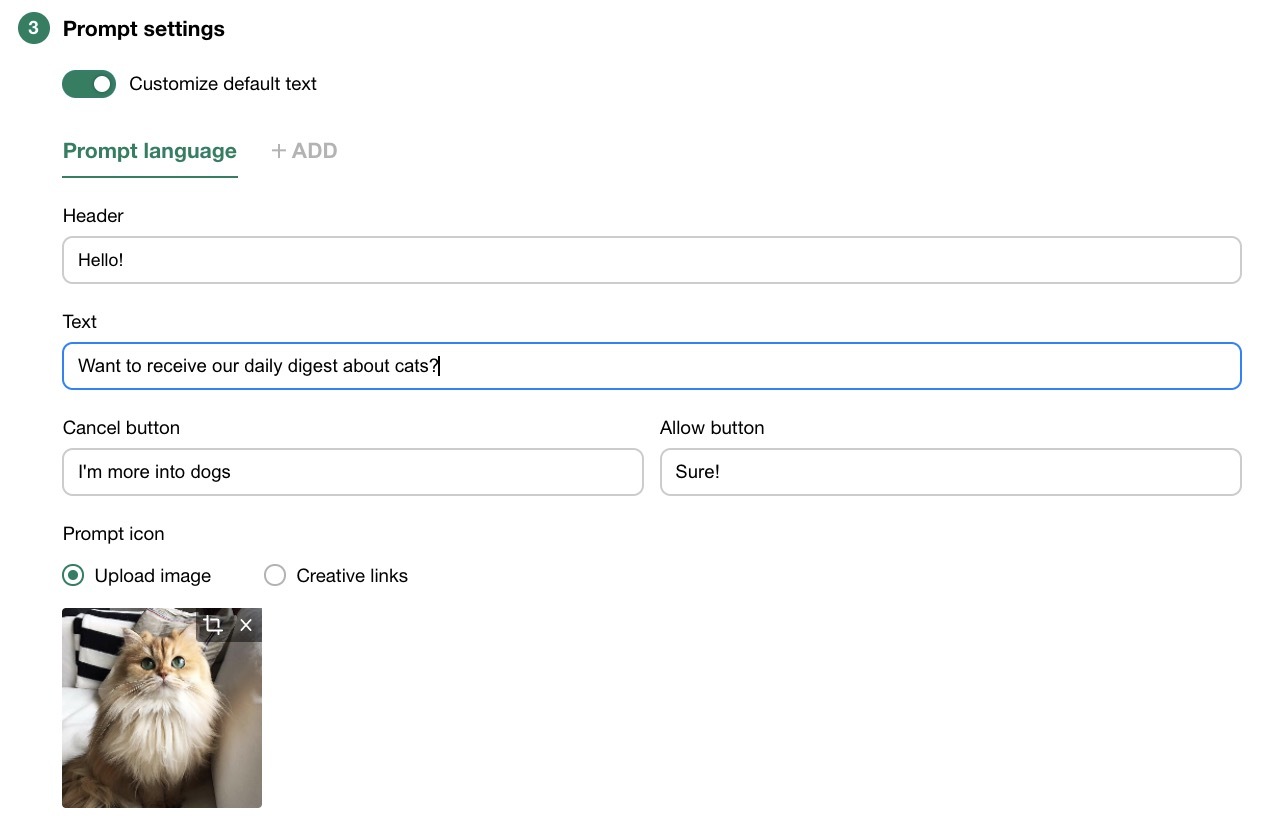
- Customize default text: this is exactly the welcome message your visitors will see within a push notification
- Check the preview on the right side of the screen to see how your final push message will appear on the website.

Quick note: Please mind that the script changes every time you add new lines (label and audience name). To make sure that your latest changes are applied, you will have to copy your tag from the dashboard each time and change it accordingly.
Users can choose their preferred themes – as many as they want. As they choose the particular category or a couple of them, you will be able to target them according to their own interests.
Second, let’s see how the Slider prompt, the most customizable one on the list, works. With its help, you can make it maximally engaging by adding your own visual and textual parts. Here is how you set things up:
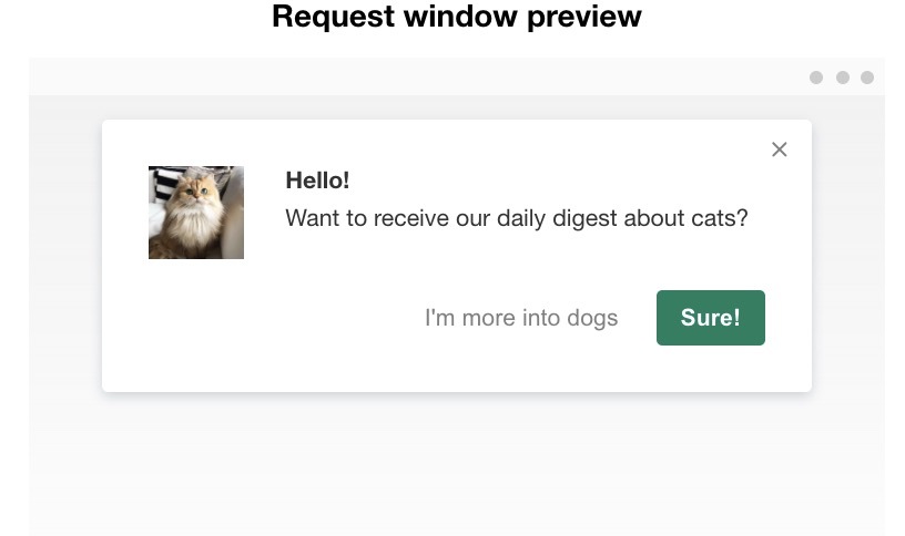
And here is how the push notification message will be displayed on the user’s screen:
Step #4: Extra customization (optional)
We have great news for publishers striving for maximal uniqueness and memorability. Notix allows you to reach the highest level of customization – you can tailor the subscription prompt from scratch in HTML and tie it to your tag with the help of API. Even though we already have a pack of customization instruments right on the platform, you can add an extra level of individuality to your opt-in messages, if needed.
Customized permission requests will make your campaigns even more personalized, especially if you categorize users by interests. So, now you know how to make your push notifications shine. Good luck and stay with Notix!
If you have any questions, feel free to contact us via email: support@notix.co.

 PT
PT ES
ES