So you created an efficient web push notification strategy. You share only the most engaging and useful content. You don’t mean to bomb your subscribers with tons of messages hourly. But you still can’t see your subscriber’s database growing. Why on earth?
The issue might be your opt-in request, and that’s good news: it all can be fixed. Let’s look at the possible reasons why your website doesn’t grow in subscribers: we don’t promise you will become as popular as Ronaldo’s Instagram, but things might get much, much better.
Opt-in requests: where the story begins
An opt-in request is the first push notification that your site’s visitor receives from you. In this message, you ask your users for permission to send them alerts. So, your subscribers’ database much depends on how your users react to this message: accept push notifications, decline, or ignore the suggestion.
It can be a very simple message like this:
Or even simpler, like this:
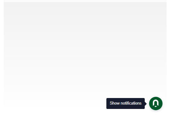
However, you can make it more complicated, like here:
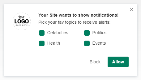
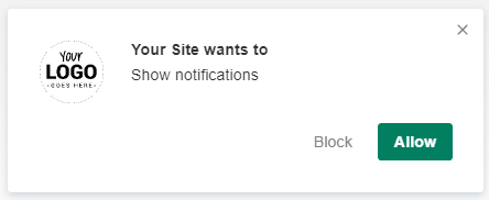
Or go for a small window called Native Browser permission prompt:
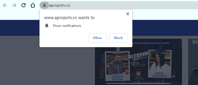
The first three options are customizable: you can change messages, button colors, or images for your opt-in request. To accept such a request, a user will need to make two clicks: the first one on your prompt, and the second one on a confirmation window that will appear immediately after.
The Native Browser prompt always looks like in the picture above but, unlike the others, allows a user to subscribe within a single click. Jumping a bit ahead, let’s mention it’s the best option for those who only need to collect as many subscribers as possible.
Whatever you choose, the main point remains the same: you can’t send any notifications to users without this permission. So, no matter how thoroughly you think over your alerts strategy and how creative your CTAs are: nothing will reach your users if they don’t opt in.
Luckily, you can increase your opt-in rate with some handy practices, and Notix gives you a range of great tools. So, here are the most typical reasons for a bad opt-in rate and possible solutions you can try out. Let’s go!
Reason 1: It’s a technical issue
Before you dive into the marketing tricks, make sure everything’s okay with your push campaign settings. To activate push alerts for your site, you need to complete two steps: put a tag on your site and locate the service worker file in the root directory.
We have detailed instructions on how to do it — right here: How do I Put a Notix Script on My Website.
Sometimes, publishers forget to add a service worker at the right place or make other mistakes. To avoid such a minor but disappointing mistake, reach our support team: we are always here to help with the integration.
Besides, Chrome’s experiments with a silent mode can also prevent a user from getting your notifications, including opt-in requests. So, if your site visitor doesn’t usually subscribe to notifications, their browser can automatically block yours, too.
Reason 2: People don’t see a reason why they need to subscribe
It’s important to show value in notifications for your future subscribers. You can go with a standard ‘Want to subscribe?’ suggestion,’ of course. However, be ready to get a high rejection rate if it’s not really obvious why your alerts can be really useful.
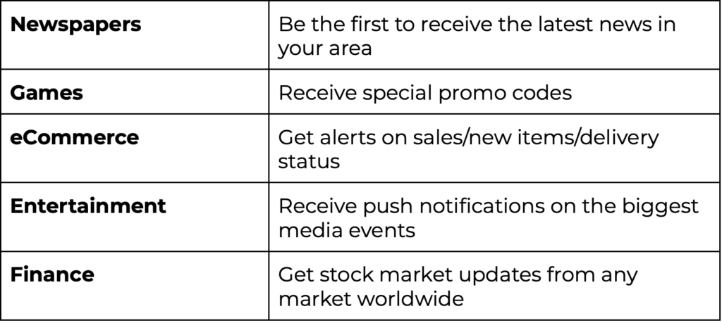
Showing value is super easy in some industries and more challenging in others. Still, you need to highlight it in both cases. For instance, if you sell some items, you can offer to receive updates on the delivery status. The value is pretty evident here, so your opt-in rate will most likely be higher than if you have, say, an online magazine.
News portals usually suggest you ‘be the first to receive the hottest news’ while browser games or iGaming portals can notify you of the newly added levels or latest promos.
Here are some examples of the value you can give to your prospective subscribers:
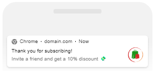
Besides, you can go further and thank your new subscribers by giving them an extra value. It is possible with the Notix welcome message feature: the first notification after opting in. You can simply say ‘thank you for subscribing,’ but it can also be a kind of a welcome bonus:
- A special promo code for subscribers, like a discount on your items;
- A referral link, that will give some value to your subscriber and can attract new ones.
It may look like this:
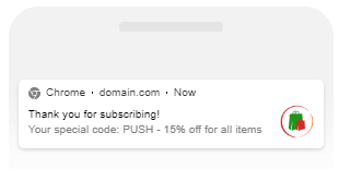
Or like this:
Reason 3: You chose the wrong time for opt-in
It’s not always a good idea to immediately attack a user with a suggestion to subscribe. You can do it, though, if you need to collect as many subscribers as possible within the shortest time. If your only goal is a large subscriber database and that’s it, you can use the following combo:
Native Browser Opt-In Prompt + Immediate Subscription Request (shows up as soon as a user visits your site).
However, what if you need more than quantity? If you want your subscribers to keep really engaged with what you send to them? Let them find their way around first then: at least, see what your website is about.
At Notix, you can set a delay before the subscription popup, so the permission alert will appear after several seconds or minutes of user activity on your page.
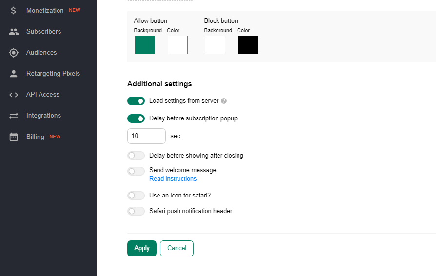
To get a better idea of how to set a delay, monitor your user behavior stats and see the average time and activity on your site. You can test various options: probably the instant pop-up will work best for you, so don’t stick to the only option once and forever.
Besides, you can send a subscription prompt only after a user performed some action at the site:
- clicked on the page;
- interacted with the page in some way: clicked on a particular button, etc.
If you need more advanced settings than the Notix SSP can offer, read the Notix guide on the additional parameters or contact our support team.
Reason 4: Your creative is not persuasive enough
When you already know the best reason why users should subscribe to your notifications, it’s essential to show it in the most effective way. All the push alert elements (text, colors, images) might matter. At Notix, you can customize all opt-in request types but the Native Browser and the most customizable one is the Slider.
Here is what you can try to improve:
Text. Your copy should be engaging and clear, delivering the main value of your push notification campaign. Feel free to use emojis:
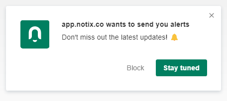
Don’t forget about Call-To-Action buttons: they are customizable, too! Try thinking of something more personalized than the standard Cancel/Allow buttons, for instance:

Colors. The psychology of colors topic is too broad to cover in detail within this article. Some experts claim that a CTA button must jump to an eye and contrast your site’s color scheme. The others advise making it look native and suit your brand color palette. One more curious take: different colors have different impacts on people: for instance, red is about passion, and orange stimulates enthusiasm.
At Notix, you can toy around with a color scheme: no need to stick to default settings. Whatever approach to design you have, you are free to use a color picker block. It allows you to choose any color and even insert an HTML color code to have the precise tone you need:
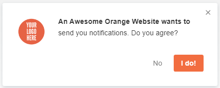
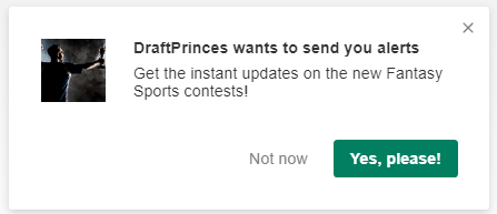
Image. You can add your images to Sliders and Categories opt-in requests. While it can be simply your website logo, you can try adding more personalization:
Reason 5: You give them no choice
Suppose you have a large news portal. A rare user might want to read literally every post you publish on your site and receive alerts on all types of news.
At Notix, you can kill two birds with one stone: help users choose from push notifications to their taste and segment your audiences for more targeted alerts. The Categories opt-in request type is at your service: add audiences and labels, and your users will tick the most interesting ones.
By the way, you can go further with customizing this prompt — when you change your CTA button color, the checkboxes are painted the same color, too:
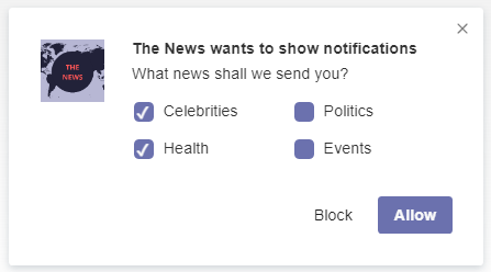
In other words, you will respond to one more objection from your customers: they won’t be afraid to get tons of irrelevant alerts on things they don’t care about.
Final words
Once you tune your opt-in request settings, make sure your customers get what you offer. A user wanted to get notifications only on the latest game releases? Don’t send them any political stuff, then. Did you promise special promo codes for everyone who opted-in? Keep your promise and deliver discounts timely.
Otherwise, your subscribers’ database will grow with every new request, but users will also keep unsubscribing.
At Notix, you can segment your subscribers and create custom audiences — for instance, using retargeting pixels. It will help to meet your users’ expectations and create smooth push notification campaigns that will retain your subscribers.
You won’t probably find the best approach to your opt-in requests from the very first attempt, but testing will definitely help.
The Notix team will help, too — don’t hesitate to contact our customer support team with whatever questions you have. Our email: support@notix.co.

 ES
ES EN
EN